Overview
My name is Ed Pirone and I am the Lead User Experience Designer at Prompt. I am aware that not everyone reading this blog is in the tech industry so I want to build a foundation about who I am and what I do. It is not uncommon for even my close friends to be confused about what exactly a UXD (User Experience Designer) does. Most of the time they assume I organize shapes, buttons, apply color, and then hand it off to engineers to do their magic, which is true. That is part of my job.
For the purpose of this reading, it is important to understand what else goes on and I cannot stress enough that this article reflects my experiences and how I view UX. I am sure there are plenty of people who would agree with me but some will not and that is okay.
What is User Experience Design
One definition of UX is “User experience (UX) design is the process of creating products that provide meaningful and relevant experiences to users.” Kind of vague. What is the process? Well, you can’t build meaningful products if you’re only harnessing the discipline of visual design (what I discussed most people think I do).
I have met more visual designers than I can keep track of that do not qualify or identify as a UX designer. That is not a knock. These people are talented visual designers. Way more so than I will ever be. I have also met UXDs that have little to no grasp on the discipline of Visual Design. Again, not a knock, we all serve a purpose when it comes to building a successful product. I am well-rounded in both disciplines but at the end of the day, I call myself a UX Designer because of the process I use to approach building out products and features.
I have to understand the users. I have to understand their problems and needs. And I have to be obsessed with figuring out a way to build efficiencies into their workflows or figure out how to transition them into better workflows.
“User experience (UX) design is the process of creating products that provide meaningful and relevant experiences to users.”
Once we identify those workflows through discovery, research, and testing, I generally start “designing” what a proof of concept or final product will actually look and feel like. So yes, color, typography, shapes, and motion are all part of my toolbox, but they mean nothing without the infrastructure of understanding.
So how do I go about doing this?
UX process at Prompt
Every organization is a little different. I worked on well-established products at a large company that require many stakeholders to be involved in the strategy and rollout of a feature or product. I worked at agencies where we built something from nothing and there were far less people involved. As a tech startup in the health industry, Prompt’s current stakeholders are an arm’s length away, which is nice. On a daily basis, I work with product, engineering, and beta testers to make critical decisions about operational workflows in a physical therapy center. Our investors get to see prototypes and final products.
So, before I ever start sketching shapes, laying out a page, tying pages together to form a product, adding color, or discussing the best text to clarify the function of a button with my team, I have to do my due diligence.
Understand
When approaching UX from a “start from nothing” startup position, we first did a ton of discovery in the space. We wanted to clarify that there actually was a problem with the way centers run and the way current EMR software operates. We had a hypothesis that efficiencies and speed could be built in but we needed to prove it rather than wing it and build a giant product.
Understanding the way our potential customers currently work was absolutely necessary. This meant teaming up with physical therapists, PT aids, PT billing professionals, and office managers. It was necessary to become experts in their field. You have better chances of winning the Mega Millions jackpot than you would at having a designer with zero understanding of how medical billing works design a physical therapy claim and billing management page that is useful to someone in the industry. It might look gorgeous. But without seeing their bottlenecks and understanding how they think, you cannot understand the problem you intend to design a solution for.
What is nice about a startup is every stakeholder works on the UX discovery and research. On any given day, you could find myself as well as our product manager, lead engineer, and sales lead, sitting in a physical therapy or medical billing office taking notes and stalking the different potential users of the product.
This process went on for months before we started “designing” anything.
As a tech startup in the health industry, Prompt’s current stakeholders are an arm’s length away, which is nice. On a daily basis, I work with product, engineering, and beta testers to make critical decisions about operational workflows in a physical therapy center. Our investors get to see prototypes and final products.
Research
It took a while but we started to feel like we had a grasp of the problems at hand and at this point it is easy to want to jump right into solutions. That would be premature. We had to do research. Our goal was to understand our users on a very broad level and go from there to create a platform.
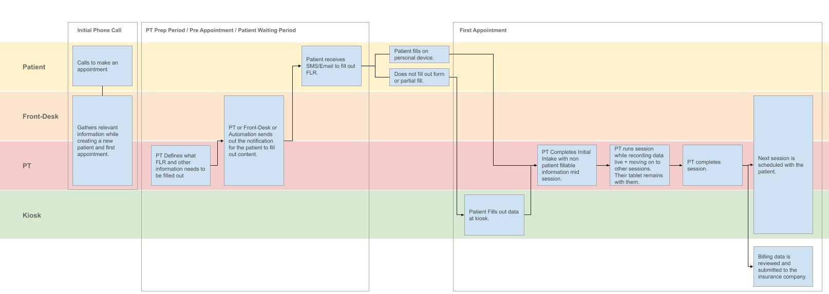
The research we performed now includes in-depth questions, understanding edge cases, understanding the journey of one of our customers patients from the time they first contact a center to the time their case is closed. Generally speaking, the process I described can (and should) be performed on a much more granular level like building a specific feature for a product like messaging or onboarding a patient. And now that we have a decent foundation, we approach features that way. But as I mentioned, with a startup where nothing exists, we did not have the luxury of resources and time necessary to focus on one specific slice of the puzzle. I digress.
We now spent another few months performing follow-up research, competitive analysis, more follow-up research, and began jotting down notes about solutions for ourselves. Again, everyone participates. No matter what your process is, or how big your company is, I find the best teams operate successfully when communication and ownership is part of every team members core values.
Sketch
Finally, the fun part. Sketching is a group effort at Prompt, primarily between UX, Product, and Engineering. We all contributed impactful mockups that made their way into the product.
Everyone does this differently. Some people whiteboard, some people sketch on paper, some people scribble on napkins or use predefined cards to represent the UI that they can move around. I happen to like working in digital media end to end. At Prompt, we work in Figma. It is important to note that we do not start sketching till we process all the discovery and research we performed in the previous two steps into some level of business requirements.
So at this point we know why we design something and what it needs to accomplish. We have an idea of the competitions shortcomings and some level of hypothesis as to how we think we can solve the users problems and improve their experience.
Great, we have a wireframe. Maybe we know what pages link to each other and what content shows up on a page, modal, or popup. Maybe we even have a decent idea of validation logic. Bottom line, if these wires are understandable to the average user and we get these in front of those users. We want to get a gut check on what they see and think. We take their feedback with a grain of salt but NONE of it gets dismissed. We just prioritize the feedback and weight of the impact. At the end of the day, if we build something that the majority of our users cannot use, we failed them. Plain and simple.
I guess that is some more research. At any point we might loop back to a previous step in the process without warning you. Deal with it.
Design
If we fail the previous step, we modify and repeat. But let us pretend we got it right on the first try (rare), we now get to start adding the visual layer that ends up in our end product. Now, I could go on and discuss the approach to visual design for a company that does not have a brand book or a mature design system. I will not do that. Suffice it to say, this is where we bring the product to life utilizing the aforementioned typography, color, grids, spacing, and motion.
Small animations for micro interactions is a great way to provide the user with visual feedback of changes in the UI and a delightful experience.
It is important to mention that even though we started out doing this from scratch, as we developed the product, we started to build out a “sticker sheet” of design patterns and those patterns eventually started to become a “design system.” I will eventually write a different blog about that and the process involved (similar to this process), but just know that the purpose of this is to have reusable parts that support our brand visually, our users’ experience, our product’s function, and our designers’/engineers’ efficiency. Design systems are all about working smarter.
Our beta testers see what the expected version of the finished product is before we ever start coding. We can get qualitative feedback so we know we are at the very least close to hitting our intended target.
Implement
At Prompt, UX writes most of the tickets (documented visual, logic, and functionality that engineering builds into the product). Our product teams work in an AGILE environment. I will not get into the details of that now (you can Google “Agile development” and find many articles that are superior to what I can write), but just know that it gives us the ability to have short release cycles, well-defined tickets for engineering, and some structure around how we move forward so our release pipeline does not end up looking like the wild west.
The important part to know about Prompt as opposed to other places I worked is that the communication feedback loop with engineering, product, and UX is ongoing. Therefore, even though I groomed these tickets, we discuss edge cases and minuscule detail during the implementation process. The more we all know about the nitty gritty of decisions being made on all sides, the better we all understand what the final output will be and what it will mean for future iterations and related features.
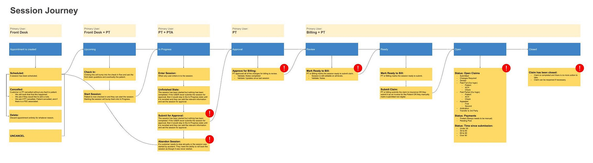
We mapped out the states a patient’s visit can exist in from start to end to work with engineering on the business logic associated with each state.
Evaluate
Measuring the success against metrics you decided before releasing is a best practice I strive to follow and we made that a part of our normal workflow. We receive feedback in early phases of design but images/wireframes or even clickable prototypes are rarely exactly the same experience as a user will have in the actual product under real-life work conditions.
Once we release a new set of features, besides getting qualitative feedback, we need quantitative feedback. We care about analytics like the time a user stays on a certain page, to the amount of times a user visits a section, to the average time it takes a user to perform a task in the product, and much more. The important part is deciding what these metrics should be so that we hold ourselves accountable and constantly drive towards a better experience for our users.
There are pieces of our product that continue to get renovated while we begin to build completely new features. Features are rarely ever “finished” because we never want to settle for good or even great. Our goal is to be “best” and “cutting edge.” In order to do that, you have to keep moving and improving.
Wrap-up
This should give you a little peek into how we approach solving our users problems. As we mature, hopefully this becomes more structured to the extent that we have a clear line between what features deserve this level of attention and what features do not. When we are making visual changes to an already tested UI, we do not take all of the steps outlined as it is not necessary. But when major changes to functionality are made or we add additional features, we try to follow this as closely as possible.
UX is an opinionated field. I am sure there are better ways to execute but being a small team has its advantages as well as disadvantages. Our team works faster than almost any team I’ve worked with. We release updates weekly and sometimes daily. At the same time, we move fast because we need to and do not always have time to A/B test or perform immediate changes based on negative feedback. We have a backlog of everything we need to address so that we can tackle it eventually and so far our beta centers see the value of a product that can exist on any platform, improves their workflows, is stable, works insanely fast, and keeps more functionality in one place so they do not have to jump around to different applications.
